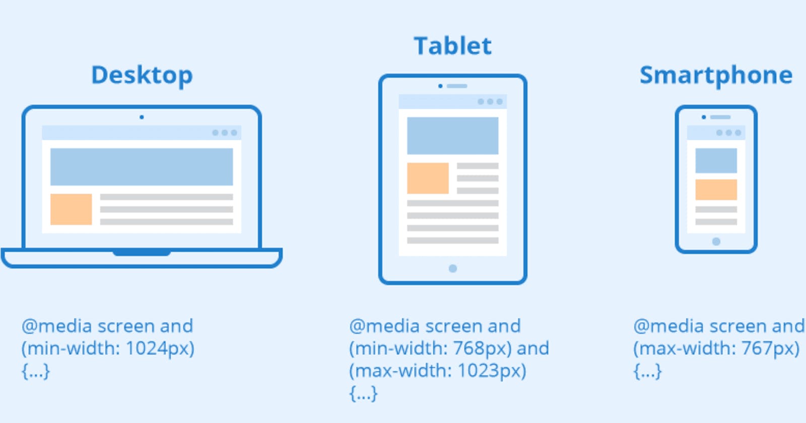
The Media query in CSS is used to create a responsive web design. It means that the view of a web page differs from system to system based on screen or media types. The breakpoint specifies for what device-width size, the content is just starting to break or deform. A media query consist of a media type that can contain one or more expression which can be either true or false. The result of the query is true if the specified media matches the type of device the document is displayed on. If the media query is true then a style sheet is applied.
Media queries can be used to check many things:
- width and height of the viewport
- width and height of the device
- Orientation
- Resolution
Syntax
@media not | only mediatype and (expression) {
    // Code content
}
Example
*Here in this example you can select any size of screen (1x, 0.5x or 0.25x) above to get responsiveness.
Output
From the output, we can see that if the max-width of the screen is reduced to 800px then the background color changes to green & if the max-width of the screen is reduced to 500px then the background color will turn to blue. For the desktop size width, the background color will be white.
Media Types in CSS
There are many types of media types which are listed below:
- all: It is used for all media devices
- print: It is used for printer.
- screen: It is used for computer screens, smartphones, etc.
- speech: It is used for screen readers that read the screen aloud.
Thanks for Reading ...
Reference- GeeksForGeeks
