

CSS Grid is a powerful tool that allows for two-dimensional layouts to be created on the web. This guide was created as a resource to help you better understand and learn Grid, and was organized in a way I thought made the most sense when learning it.
Properties of CSS Grid Layout (For Parent/Container)
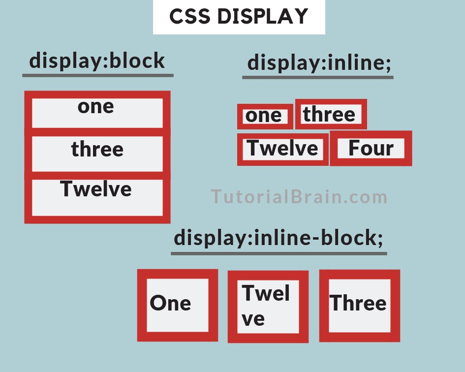
Display Property
The display CSS property sets whether an element is treated as a block or inline element and the layout used for its children, such as flow layout, grid or flex.
grid-template-columns
The grid-template-columns CSS property defines the line names and track sizing functions of the grid columns.
Syntax
.container {
  grid-template-columns: ...  ...;
  /* e.g.
      1fr 1fr
      minmax(10px, 1fr) 3fr
      repeat(5, 1fr)
      50px auto 100px 1fr
  */
}
grid-template-rows
The grid-template-rows CSS property defines the line names and track sizing functions of the grid rows.
Syntax
.container {
 grid-template-rows: ... ...;
  /* e.g.
      min-content 1fr min-content
      100px 1fr max-content
  */
}
grid-template
A shorthand for setting grid-template-rows, grid-template-columns, and grid-template-areas in a single declaration.
Syntax
.container {
  grid-template: none | <grid-template-rows> / <grid-template-columns>;
}
gap & grid-gap
A shorthand for row-gap and column-gap
Syntax
.container {
  /* standard */
  gap: <grid-row-gap> <grid-column-gap>;

  /* old */
  grid-gap: <grid-row-gap> <grid-column-gap>;
}
justify-items
Aligns grid items along the inline (row) axis (as opposed to align-items which aligns along the block (column) axis). This value applies to all grid items inside the container.
Values:
- start – aligns items to be flush with the start edge of their cell
- end – aligns items to be flush with the end edge of their cell
- center – aligns items in the center of their cell
- stretch – fills the whole width of the cell (this is the default)
Syntax
.container {
  justify-items: start | end | center | stretch;
}
align-items
Aligns grid items along the block (column) axis (as opposed to justify-items which aligns along the inline (row) axis). This value applies to all grid items inside the container.
Values:
- stretch – fills the whole height of the cell (this is the default)
- start – aligns items to be flush with the start edge of their cell
- end – aligns items to be flush with the end edge of their cell
- center – aligns items in the center of their cell
- baseline – align items along text baseline. There are modifiers to baseline — first baseline and - - last baseline which will use the baseline from the first or last line in the case of multi-line text.
Syntax
.container {
  align-items: start | end | center | stretch;
}
place-items
place-items sets both the align-items and justify-items properties in a single declaration.
Syntax
.center {
  display: grid;
  place-items: center;
}
justify-content
Sometimes the total size of your grid might be less than the size of its grid container. This could happen if all of your grid items are sized with non-flexible units like px. In this case you can set the alignment of the grid within the grid container. This property aligns the grid along the inline (row) axis (as opposed to align-content which aligns the grid along the block (column) axis).
Values:
- start – aligns the grid to be flush with the start edge of the grid container
- end – aligns the grid to be flush with the end edge of the grid container
- center – aligns the grid in the center of the grid container
- stretch – resizes the grid items to allow the grid to fill the full width of the grid container
- space-around – places an even amount of space between each grid item, with half-sized spaces on the far ends
- space-between – places an even amount of space between each grid item, with no space at the far ends
- space-evenly – places an even amount of space between each grid item, including the far ends
Syntax
.container {
  justify-content: start | end | center | stretch | space-around | space-between | space-evenly;
}
align-content
Sometimes the total size of your grid might be less than the size of its grid container. This could happen if all of your grid items are sized with non-flexible units like px. In this case you can set the alignment of the grid within the grid container. This property aligns the grid along the block (column) axis (as opposed to justify-content which aligns the grid along the inline (row) axis).
Values:
- start – aligns the grid to be flush with the start edge of the grid container
- end – aligns the grid to be flush with the end edge of the grid container
- center – aligns the grid in the center of the grid container
- stretch – resizes the grid items to allow the grid to fill the full height of the grid container
- space-around – places an even amount of space between each grid item, with half-sized spaces on the far ends
- space-between – places an even amount of space between each grid item, with no space at the far ends
- space-evenly – places an even amount of space between each grid item, including the far ends
Syntax
.container {
  align-content: start | end | center | stretch | space-around | space-between | space-evenly;
}
## Properties of CSS Grid Layout (For Children/Items)
grid-column-start, grid-column-end, grid-row-start, grid-row-end
Determines a grid item’s location within the grid by referring to specific grid lines. grid-column-start/grid-row-start is the line where the item begins, and grid-column-end/grid-row-end is the line where the item ends.
Values:
- – can be a number to refer to a numbered grid line, or a name to refer to a named grid line
- span – the item will span across the provided number of grid tracks
- span – the item will span across until it hits the next line with the provided name
- auto – indicates auto-placement, an automatic span, or a default span of one
Syntax
.item {
  grid-column-start: <number> | <name> | span <number> | span <name> | auto;
  grid-column-end: <number> | <name> | span <number> | span <name> | auto;
  grid-row-start: <number> | <name> | span <number> | span <name> | auto;
  grid-row-end: <number> | <name> | span <number> | span <name> | auto;
}
grid-column, grid-row
Shorthand for grid-column-start + grid-column-end, and grid-row-start + grid-row-end, respectively.
Values:
- / – each one accepts all the same values as the longhand version, including span
Syntax
.item {
  grid-column: <start-line> / <end-line> | <start-line> / span <value>;
  grid-row: <start-line> / <end-line> | <start-line> / span <value>;
}
grid-area
Gives an item a name so that it can be referenced by a template created with the grid-template-areas property. Alternatively, this property can be used as an even shorter shorthand for grid-row-start + grid-column-start + grid-row-end + grid-column-end.
Values:
- – a name of your choosing
- / / / – can be numbers or named lines
Syntax
.item {
  grid-area: <name> | <row-start> / <column-start> / <row-end> / <column-end>;
}
justify-self
Aligns a grid item inside a cell along the inline (row) axis (as opposed to align-self which aligns along the block (column) axis). This value applies to a grid item inside a single cell.
Values:
- start – aligns the grid item to be flush with the start edge of the cell
- end – aligns the grid item to be flush with the end edge of the cell
- center – aligns the grid item in the center of the cell
- stretch – fills the whole width of the cell (this is the default)
Syntax
.item {
  justify-self: start | end | center | stretch;
}
align-self
Aligns a grid item inside a cell along the block (column) axis (as opposed to justify-self which aligns along the inline (row) axis). This value applies to the content inside a single grid item.
Values:
- start – aligns the grid item to be flush with the start edge of the cell
- end – aligns the grid item to be flush with the end edge of the cell
- center – aligns the grid item in the center of the cell
- stretch – fills the whole height of the cell (this is the default)
Syntax
.item {
  align-self: start | end | center | stretch;
}
place-self
place-self sets both the align-self and justify-self properties in a single declaration.
Values:
- auto – The “default” alignment for the layout mode.
- / – The first value sets align-self, the second value justify-self. If the second value is omitted, the first value is assigned to both properties.
Syntax
.item-a {
  place-self: center;
}
This guide is designed to give you a fairly comprehensive overview of Grid; however, it doesn’t pretend to be a complete technical documentation. Be sure to check out the specs of Mozilla Developer Network and CSS-Tricks.
Thanks for reading...
Reference - css-tricks